
01. Workshop
Initial kickoff workshop with stakeholders, planning key topics and direction.
NOW Finance's 'Get My Rate' (GMR) Application flow was the second half of a 2-phase project seeking to rebrand and significantly increase both their brand presence and best-in-class UX in Australia's highly competitive small-medium-sized loan space.
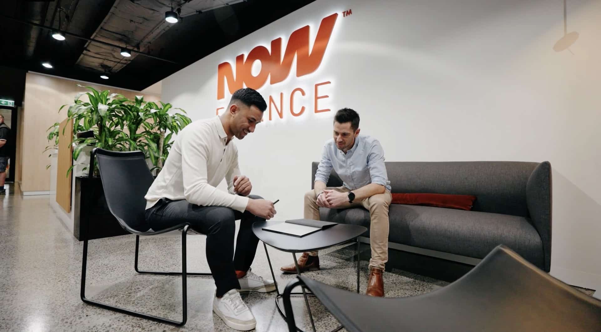
This project was undertaken during my time at Melbourne's premium Web Design Agency BJM Digital.
The research component of the project was a partnership between BJM Digital, NOW Finance and Australian recruitment and testing platform Testmate.
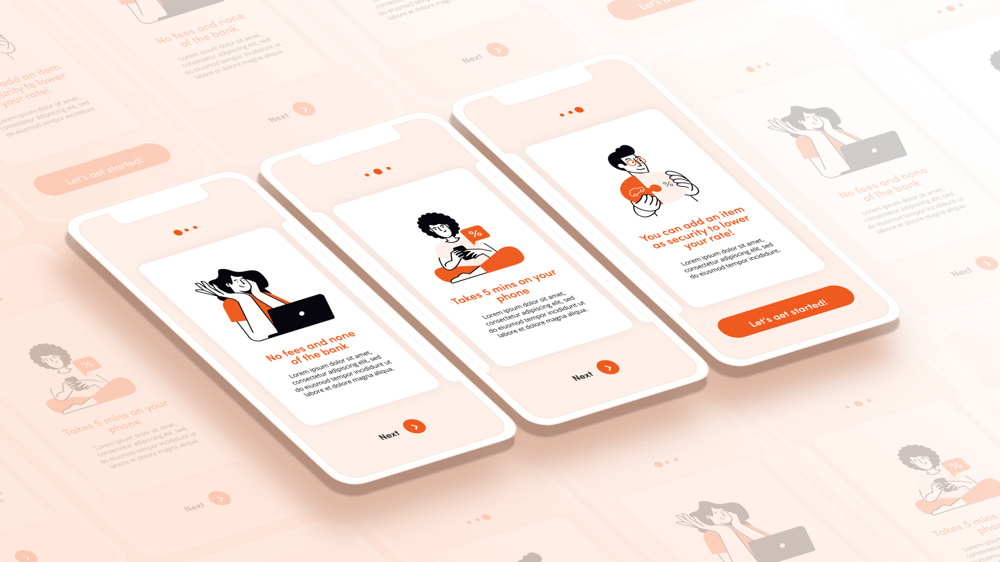
Working alongside the client, we created 3 separate high-fidelity flows that compared NOWFinance’s existing application flow against 2 of Australia’s leading loan brands.
The insights were surprising to say the least.
From gender-specific behaviours, to a desire to long form copy, many preliminary designs had to be reconsidered:
Gender-specific search behaviour
Trustworthiness increased with high-bar requirements & legalese
Orientation and expectation lacking for all loan providers.
These insights were actually super exciting,
as we now knew how to leverage NOW Finance’s brand position as a result.
Lean into the legalese. While putting in a concerted effort to make the actual tone more approachable, we wanted to live out the adage ‘don’t fix what ain’t broke’, there was no point in stripping the copy back if it was a major point of trustworthiness.
Keep position and options present continually. While this is a commonly-held belief amongst designers and service providers alike, it’s harder than you think. Navigation can be too prominent, too detailed, not useful, off-putting – or just plain lost – to a myriad of other design considerations in an application flow. A lot of time and design thinking was dedicated to the right level of information density, as well as multiple methods of display / findability.
Clarify flow
As lack of clarity for next steps was nearly universal for adopters, setting clear steps was highest priority.
Previously lost to many applicants, one of the biggest benefits of NOW Finance’s product offering was no fees, and no unnecessary bureaucratic red tape. This was placed first thing.
The clarity and simplicity at each stage of the applicant’s journey meant the application process was measurably quicker, and felt faster on average from the site statistics and feedback.
Despite the total form fields being more numerous.
Previous applicants showed uncertainty around ‘Security Assets’, assuming it was an added security for their loan, rather than them needing to provide a security asset to lower their interest rate or payment term.
Clarifying this before reaching this stage significantly lowered confusion.

Clarify flow
As lack of clarity for next steps was nearly universal for adopters, setting clear steps was highest priority.
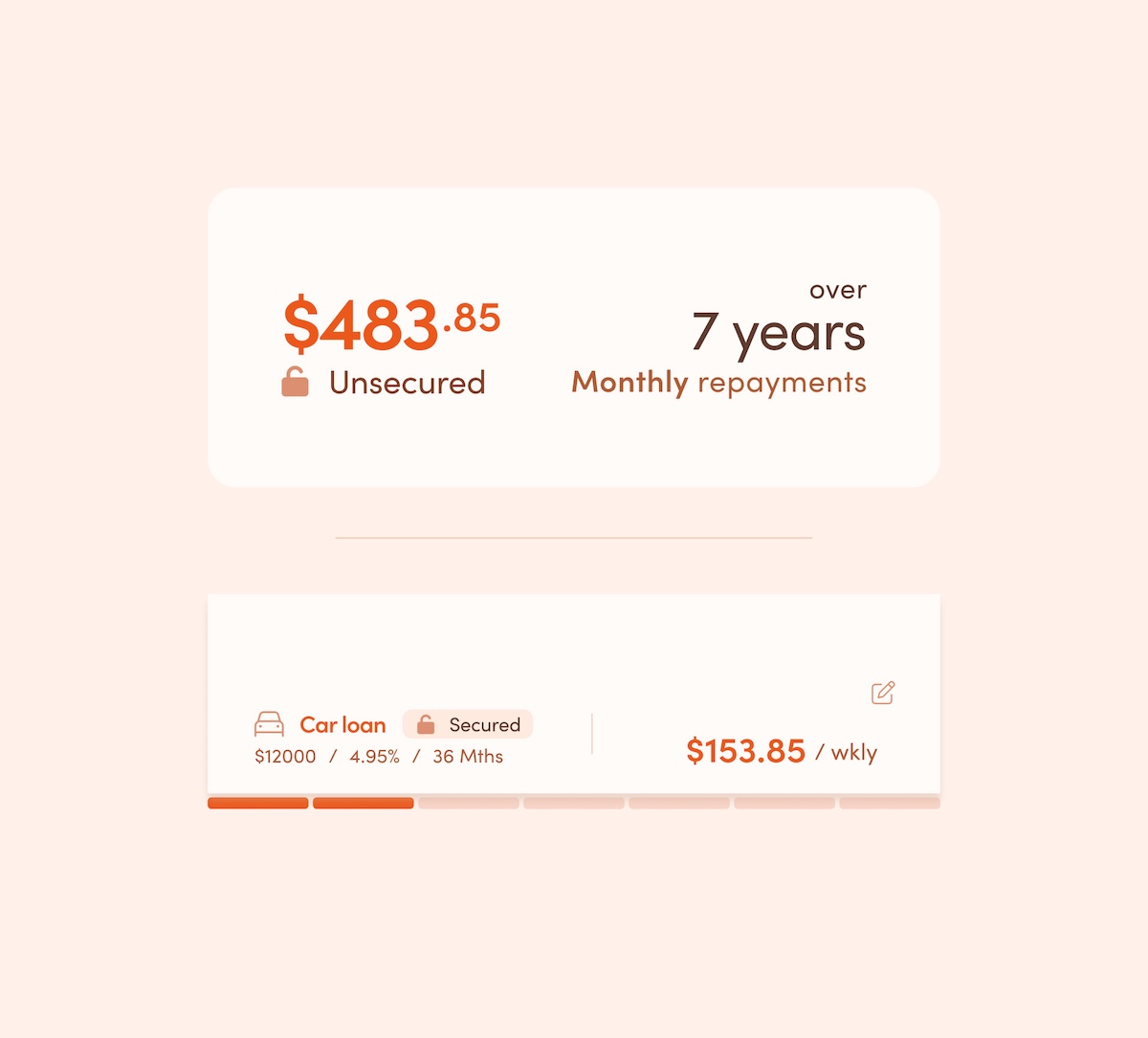
The Loan Summary Card is a full-detailed, quick-reference card presented to the user on both the Loan presentation page, also the top of the following Loan application page.
As users are often presented with a large volume of information, it’s easy to miss important details, so considerable time was dedicated to keeping the info presentable, sectioned, memorable, and editable.
On scroll, the card contracts to maximise screen real estate, and becomes sticky so users always know what loan they’re applying for and where they are in the process.
It has all the functionality of the full-sized card, with the addition of API-driven progress steps.
The steps are filled once all fields in a section are checked and confirmed from the back end.
Twice the average loan applications were completed by the second month alone, and continue to rise.
Because of the clearer pathway, more applications were submitted, paying for the cost of the project in around 10 days.
Ut elit tellus, luctus nec magna mattis et, pulvinar dapibus lorem leo ultricies et vitae enim.
Ut elit tellus, luctus nec magna mattis et, pulvinar dapibus lorem leo ultricies et vitae enim.
Immersive web experiences
Tap into a vast library of free, beautiful animations or create your own using Adobe After Effects.
Build gorgeous megamenus with columns, images, icons, and buttons all through an easy interface.
Advanced AJAX search functionality with multiple layout options that are capable of bringing up results in real-time.


