
01. Workshop
Initial kickoff workshop with stakeholders, planning key topics and direction.
Pivoting from a highly-taxing ‘reactionary’ model, RSPCA Queensland has always been built around a reactive business model with high call volumes and driver callouts. Recently deciding to pivot to a responsive & educational model, which seeks to educate and empower adopters and donors to respond appropriately in situations where professional assistance is not needed.
This project was undertaken during my time at Melbourne's premium Web Design Agency BJM Digital.
The main sections of the design were:
To get an effective framework around how to execute this new direction, our research goals were to gain a solid understanding of their current positioning in their user’s mind.
In essence, ‘what do your adopters and donors really think of you’? ‘What do they really need from you? Are you currently providing it?’
We aimed to dig as deeply as possible some of the more foundational needs that users have – as much of the future direction of any company’s success is found in continuing to tailor and refine solutions that meet the core needs of their customer base, as opposed to adopting novel trends and features.
From here, we covered a a broad base of adopters and donors of wildlife causes – from loyal contributors to those openly negative toward the brand – in order to ascertain as accurate a picture as possible. Based on this, we could prioritise the most pertinent strengths and weaknesses that needed to be addressed in their site design.
From this research, the insights gleaned highlighted vital current user behaviours and sentiment towards RSPCA, which informed the redesign accordingly for each element of their future positioning and service offering – drastically reducing unnecessary call-outs and and staff training and changing the game at a grassroots level.
Donors fatigued & overstretched
Adopters have higher trust, and more of a product lens
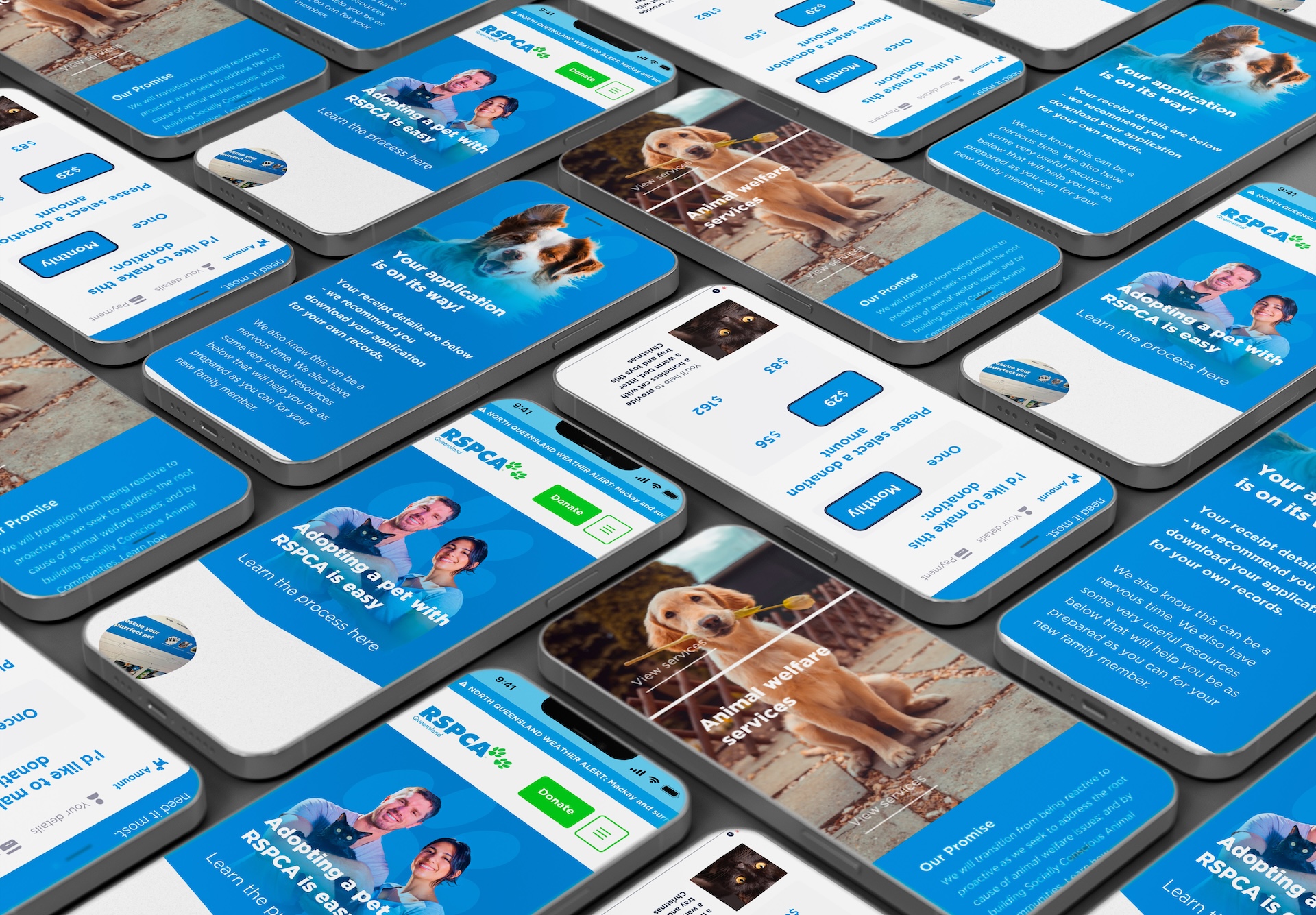
Mobile adoption highest priority (unsurprisingly)
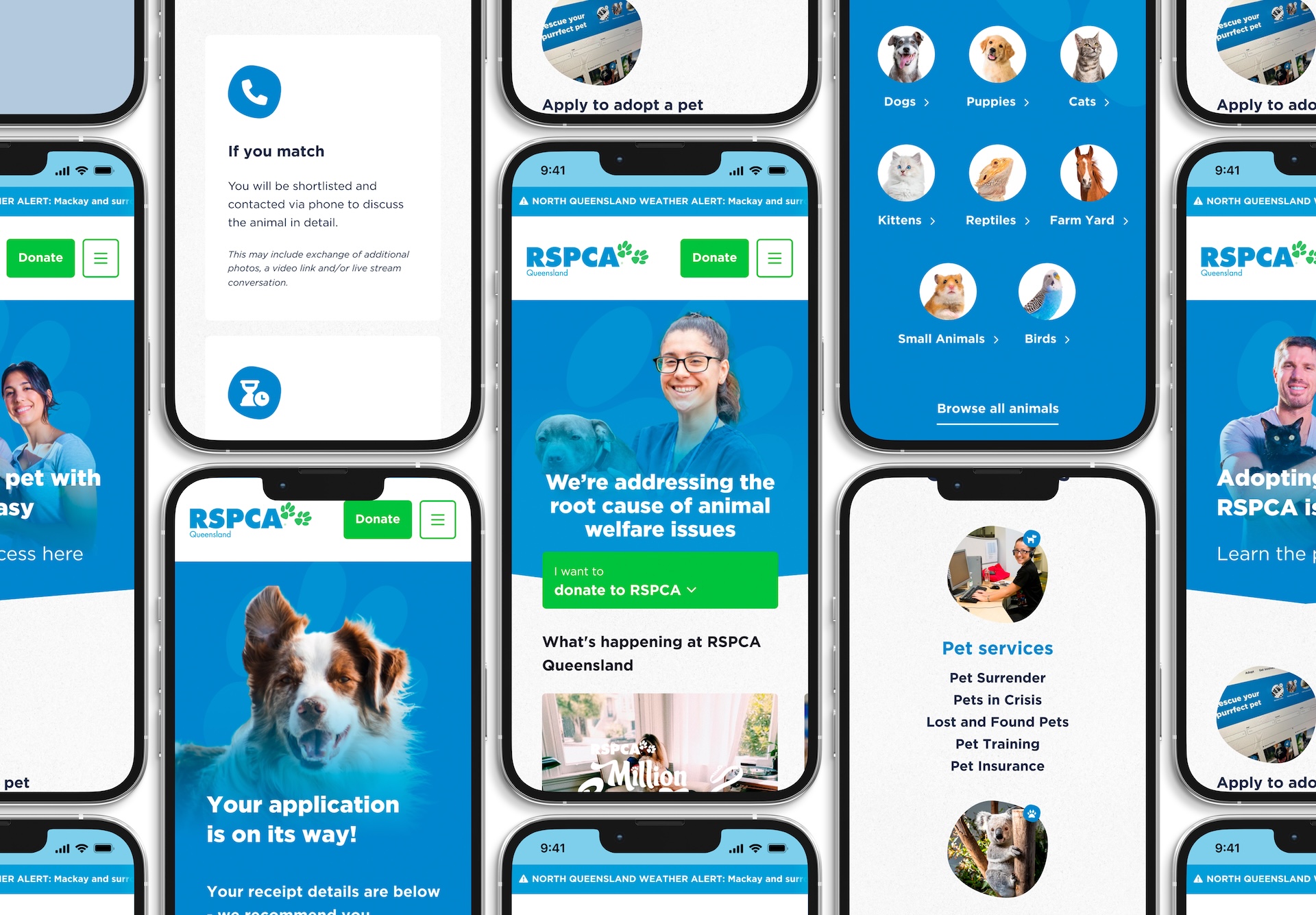
Simplified navigation
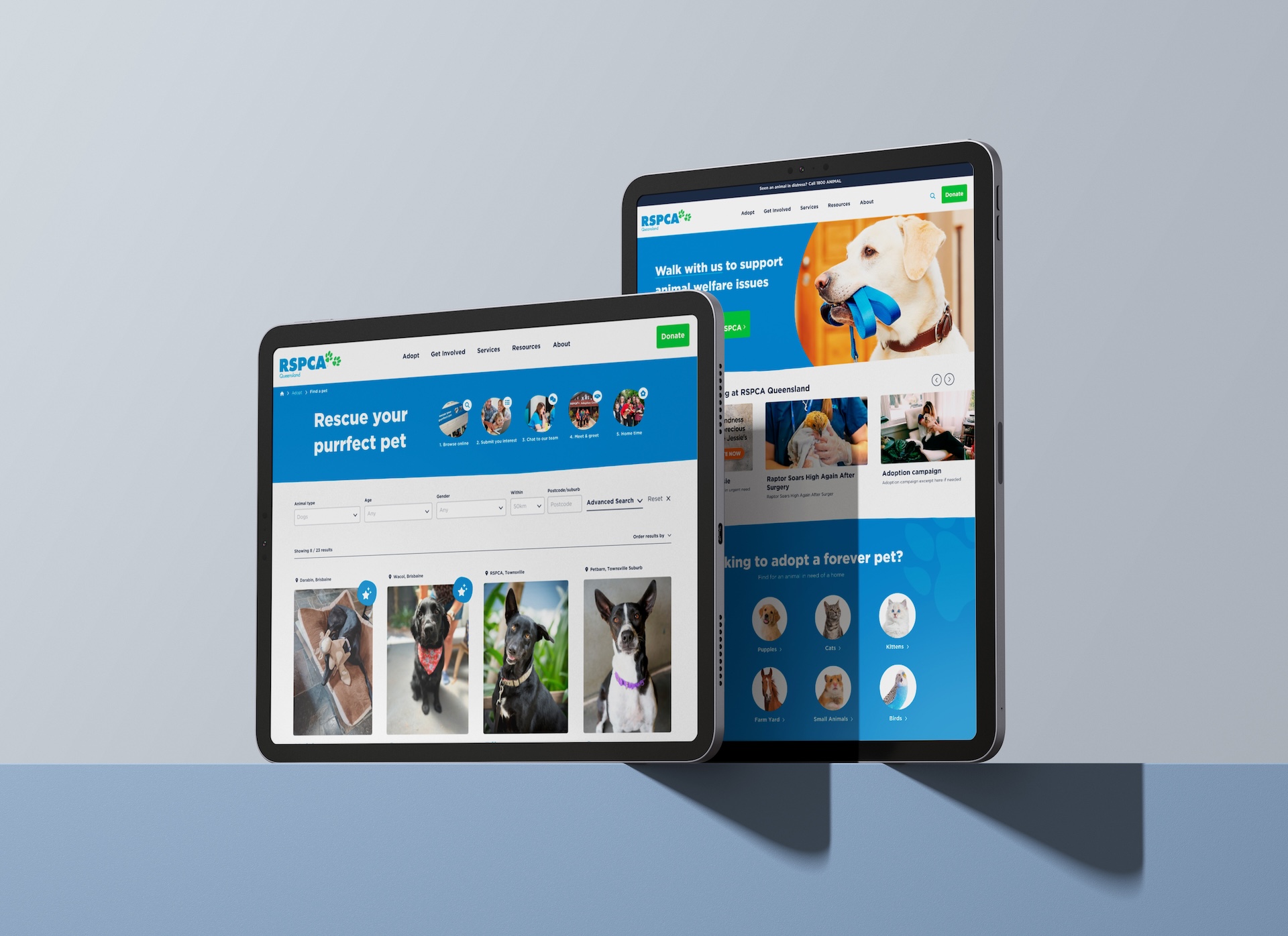
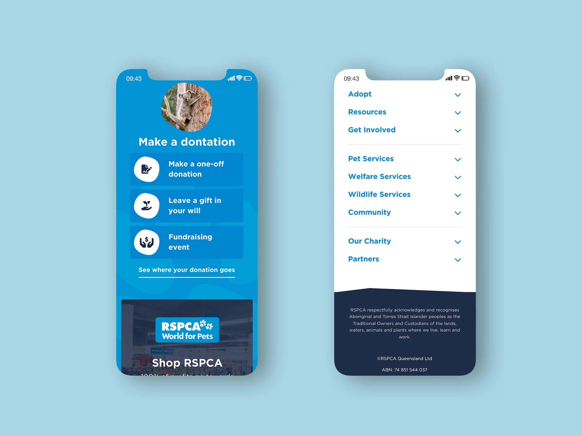
With so many product offerings, services and options, the menus & nav had gotten far too bloated. A main task ahead was to keep all the options available and findable, while cutting down on initial screen real-estate and cognitive load.
Providing new and existing users with a start point when arriving at the site, the quick actions menu cycles through common options to helps less explorative users to see what’s on offer, what they can expect, and what moves to take next.
The shortlist of options are an amalgamation of results from user testing, analytic data and business goals.
The ordering, and even the copy is a result of careful collaboration with the client, balancing the most frequent tasks on the site with pages that RSPCA needed to float highly, such as educational pieces.
it’s also imperative to meet certain business goals that don’t immediately align the most common user-needs.
In RSPCA’s case, this involves their major pivot from a reactive ‘call-out’ model to a longer term educational and preventative model, prioritising the new services and language that goes with it.
Along with this new direction is the exisiting need for consistent, easy and intuitive donation.
Objection handling is crucial when in any sell or big ask – and a strong highlight from the research was a wide range of varying beliefs around RSPCA’s responsibility and benevolence.
Regardless of its factuality, the users’ sentiments of RSPCA’s funding, treatment of animals and engagement with the community varied wildly.
This spurned us to float a conspicuous, simple and somewhat baited page title that sought to address common concerns, acting as a preemptive objection handling, especially those ‘checking out’ the brand’s claims and legitimacy.

Opening up multiple pathways
Another key takeaway is that there always needs to be multiple paths to navigate to common goals.
This is due to the various mental models users have in perceiving a task, which is especially true of higher-aware brands and products.
Whether your users are explorative, direct navigators, or more risk-averse, bite-size steps and multiple paths can be the difference between success and user drop-off.
Providing new and existing users with a start point when arriving at the site, the quick actions menu cycles through common options to helps less explorative users to see what’s on offer, what they can expect, and what moves to take next.
The shortlist of options are an amalgamation of results from user testing, analytic data and business goals.
The ordering, and even the copy is a result of careful collaboration with the client, balancing the most frequent tasks on the site with pages that RSPCA needed to float highly, such as educational pieces.
As is most commonly the case, a search field is a great option for those that know what they’re looking for, but are not quite sure where it would be located.
Multiple navigation pathways are also crucial for users of various mental models, to arrive at the same page.

Clarify flow
As lack of clarity for next steps was nearly universal for adopters, setting clear steps was highest priority.
As with many content, services and product-rich sites, breadcrumbs and progress steps are crucial to giving context to both orientation and time expectations.
This was a major pain point from the research, and had incredible success in User Acceptance Testing (UAT).
In any kind of ‘product-based’ grid page, filters are of course a must.
But deciding which are crucial, what language users intuitively use, and how to best order them needs to be carefully tested and considered.
Filters and menus often need to go through several iterations to align the clients’ goals, back-end capabilities with the core user needs.
The adoption cards also went through a considerable design process.
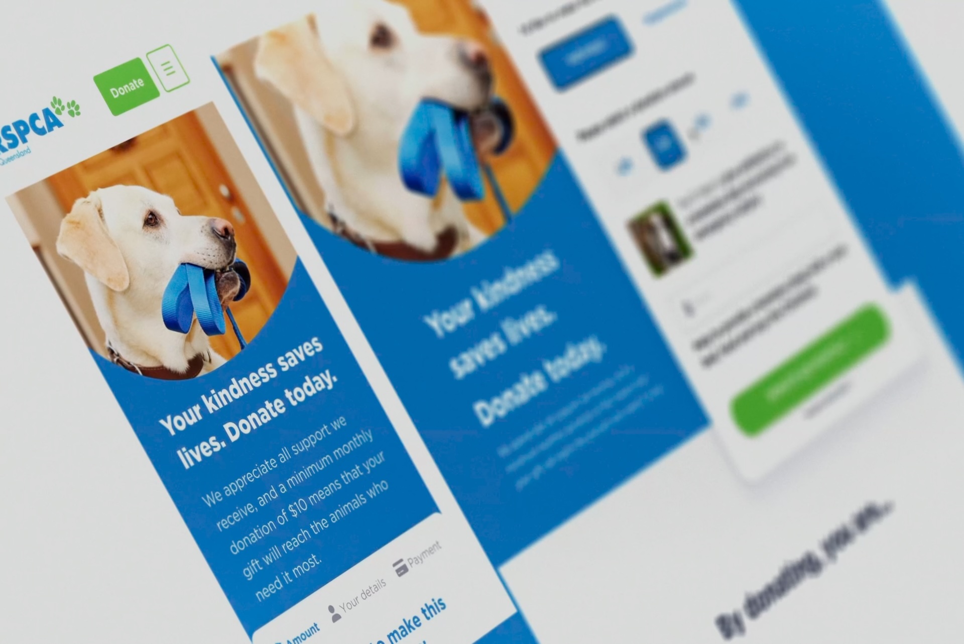
Having a native SalesForce payment modal was a no-brainer, as integration with and instantaneous responsiveness goes hand-in-hand with RSPCA’s existing SalesForce back-end.
The improvements to the existing modal are multi-step, custom payment amount tabs, and much, much faster response times.
‘Visibility of system status’ is established and robust UX psychology, and is crucial for payment and application flows.
Always knowing where you are, what options are available, and what to expect next is a must wherever possible.
This drastically reduces uncertainty and anxiety, increasing retention and completion rates for users’ job-to-be-done’.
Each pre-assigned donation tab shows a different image & message, displaying specific metrics & outcomes that donors can identify and resonate with.

User Acceptance Testing (UAT)
Client and user feedback had unanimous, positive feedback, with speed, understanding and sentiment incredibly high.
With the site’s development nearly complete, the site is due to be live April this year.
Usability tests give scores above 80%; sometimes above 90%.
Blind tests showed far higher recognition and alignment with RSPCA’s core services.
Testing also showed extremely high level of satisfaction for usability (~90%).
In line with initial hypotheses, all navigational pathways were used.


