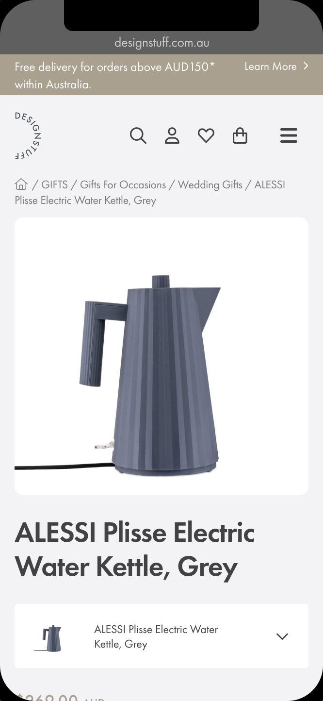
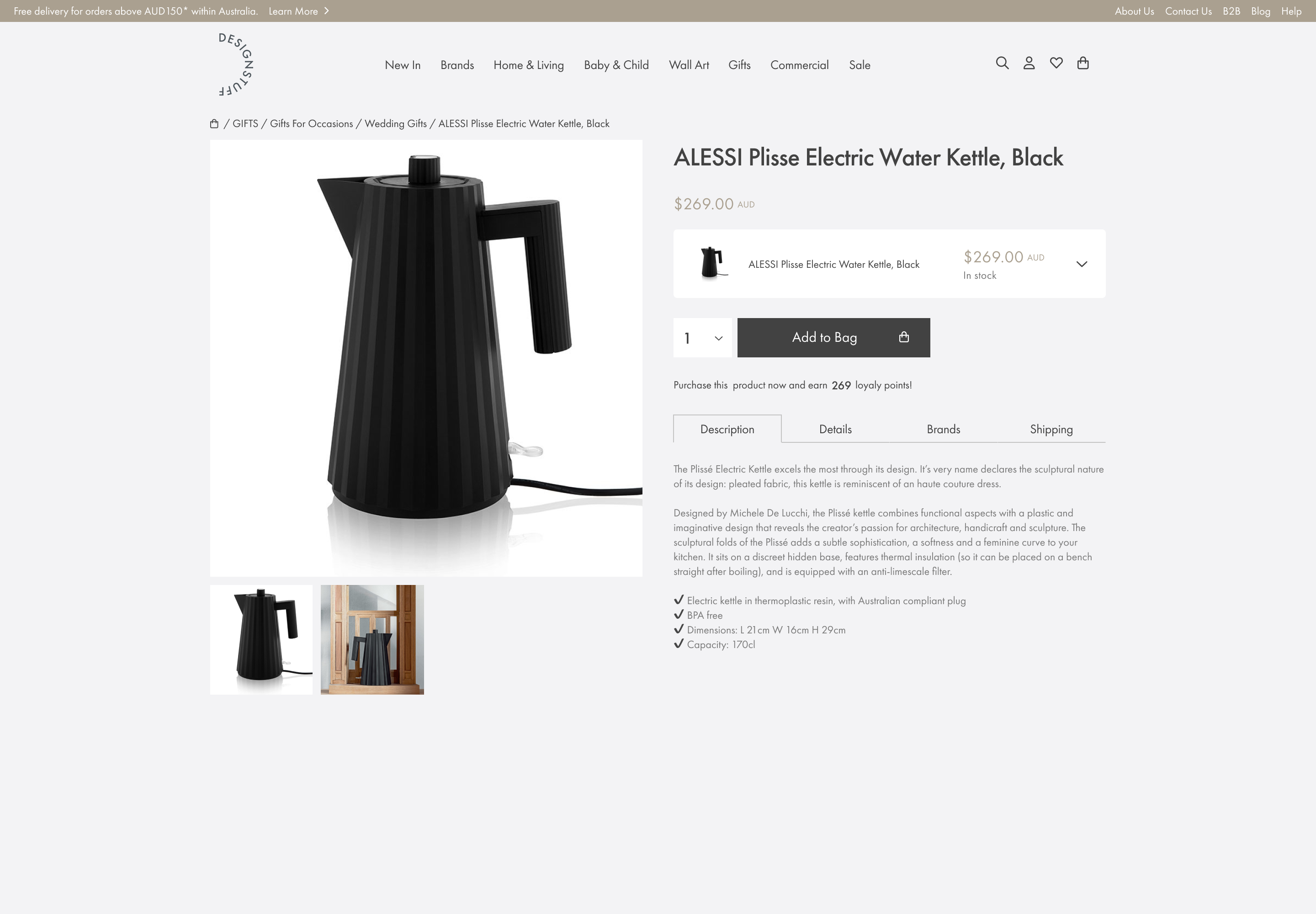
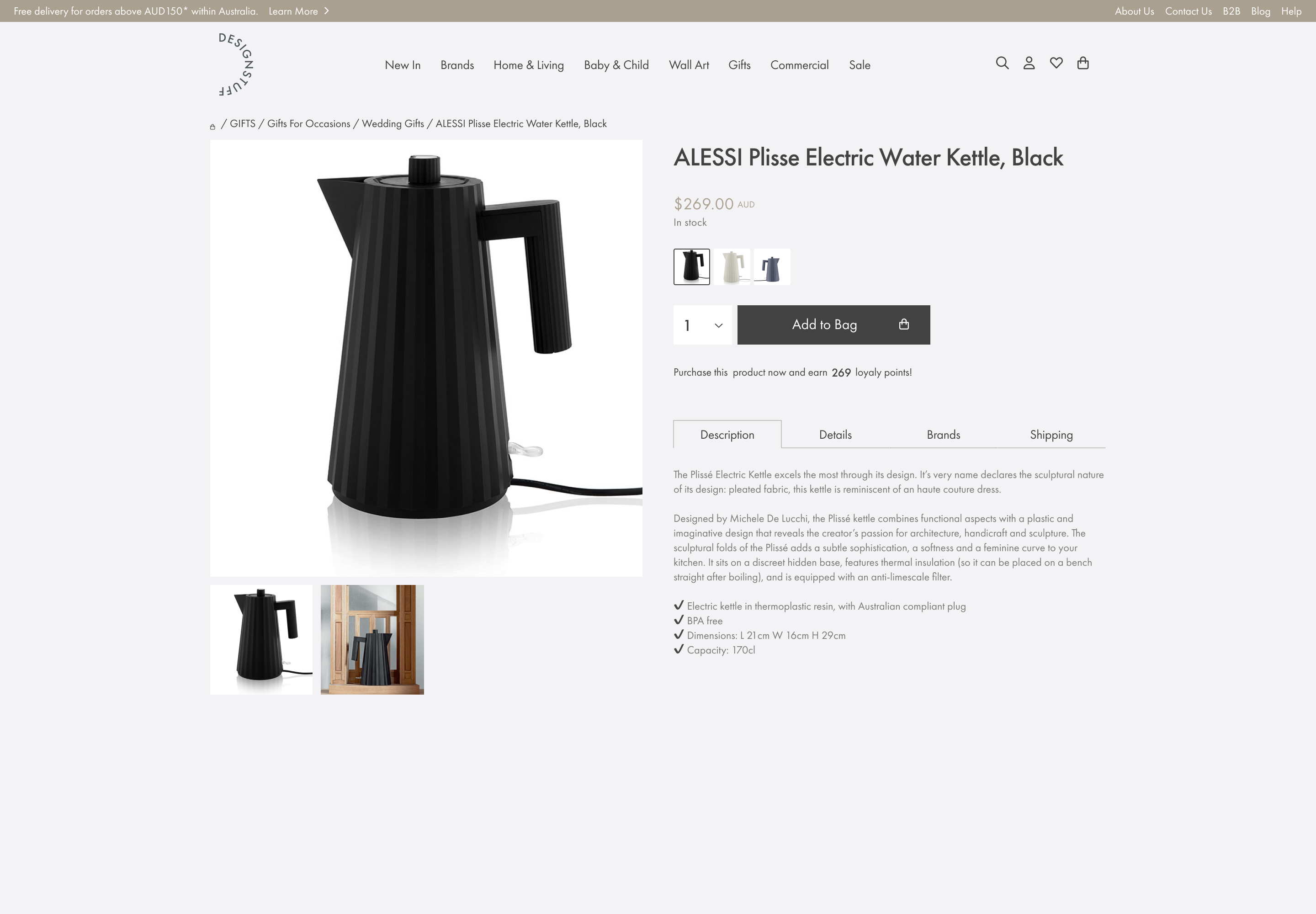
While colour swatches are now commonplace, they weren’t always so, relying on text fields or exessively bloated product result pages, showing every variant of every product.
Task:
Design an intuitive enhancement
- grouped by colour & material,
- while maintaining a unique URL.

Explorations
Design options
Colour swatches
- Standard worldwide
- Recognisable & simple.
- Has the feel of one item with many variants.
- No text field
- No material description
- Suggests each option on same page

Dropdown list
-
more screen real estate for unique copy and variant descriptions
-
a visual queue that each item is a separate page
- Less intuitive for speedy ecom purchases
- Options not visible at a glance
- Larger screen area

Thumbnails
- Small and versatile
- All options visible at a glance
- Exact imagery reduces guesswork
- No text or material descriptions
- Images can be too small to see detail
- Tiny imagery can slow perception, and increase mental load

Clickable prototype
Have a play!
Mobile
Click anywhere in the frame
F – Fullscreen
R – restart
L–R – cycle through the frames
Desktop prototype
Final designs
Simple solutions are very rarely simple
Many elements need to be factored in to make a component fit in seamlessly to its wider environment, including:
Screen space
Designing a component that fits into the wider frame without distracting – or disappearing – into the larger picture
Editability
Giving cues and courses of action to edit event details such as time, location & attendees.
Touch area
Keeping things intuitive & usable, factoring in the right placement on the frame, acknowledging current UX design standards.
Detail clustering
Showing the right amount of detail without overwhelming, while using the right affordances and cues to indicate all that’s under the hood.


